top of page

Shachmon is a Hebrew display typeface inspired by the neighborhood where I grew up in Eilat. The structure of the streets, the long curved roads and the suburban atmosphere of the area became the foundation for the typeface’s visual language.
Designed mainly for headlines and large scale typography, the font combines modern geometric forms with softer rounded details.


Process & References
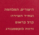
The typeface was influenced by the urban layout of Shachmon, desert landscapes and older Hebrew typefaces such as Levenim and Leiblings Sans Serif.
A central part of the process was translating the physical feeling of the neighborhood into typographic form through curves, proportions and imperfect structures. The project moved between structured typographic decisions and a more
intuitive drawing approach.


Shachmon became more than a typeface project, it turned into a personal interpretation of place, memory and visual culture. Through the process,
the project explored how typography can carry atmosphere and identity while still remaining bold, functional and contemporary.
The final result is a display typeface
that reflects both personal history and a broader graphic language
connected to Eilat.


If I made you curious, lets contact, We could figure out how to work together.
If I made you curious, lets contact, We could figure out how to work together.
bottom of page